The Client
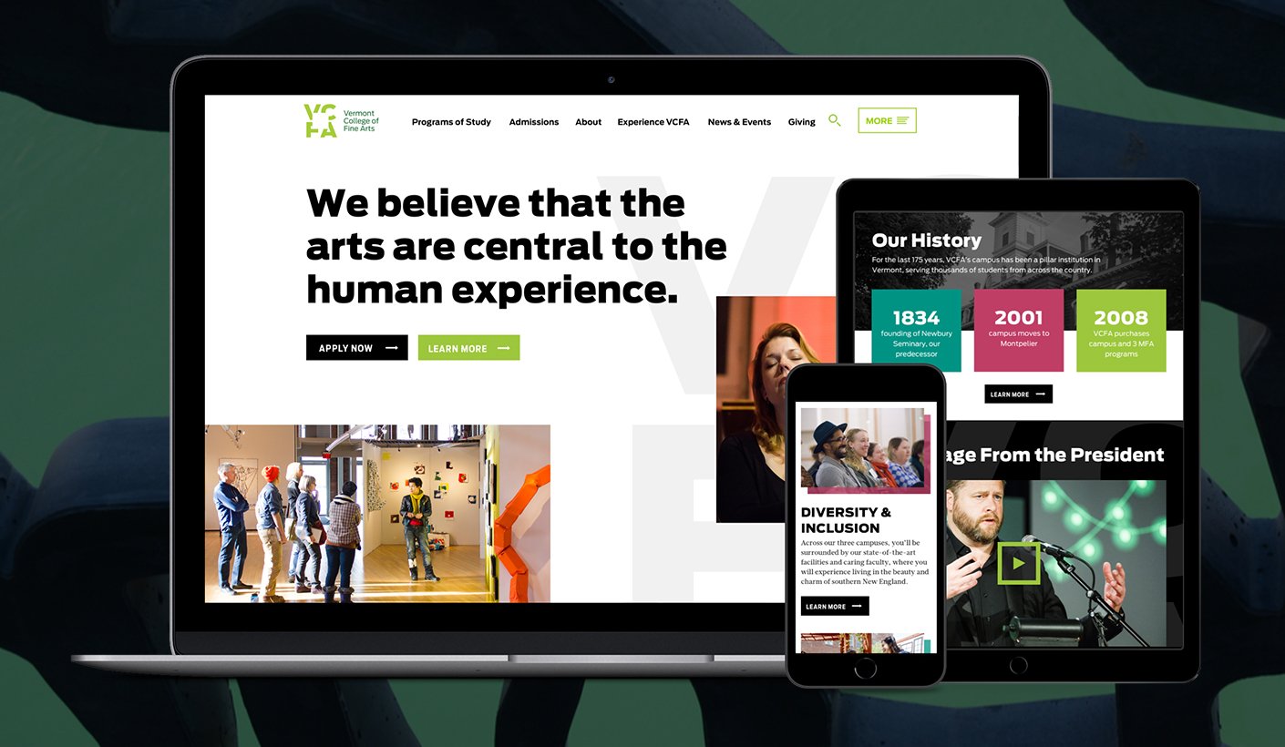
Vermont College of Fine Arts (VCFA) is a private graduate-level art school that offers low-residency and residence Master’s degree programs. With all the rigor and support of a traditional MFA program, it is designed for students desiring more flexible structures to fit their lives and schedules.
The Challenge
With an outdated site structure, important information about VCFA’s programs and admissions was buried under complex and overlapping content hierarchies. In order to boost the clarity of their low-residency programs and increase admissions, VCFA partnered with Constructive to find a better way to differentiate their arts programs, and celebrate their sense of community spirit and campus culture.
This case study shows our team’s whole process. I designed the UX for each page layout, as well as the translation of these pages into visual design.
Role
UX/UI Designer
Focus Areas
Creative Direction
Information Architecture
User Experience Design
Web Design
Collaborators
Constructive Team
Designing the VCFA Experience
Understanding Diverse User Needs
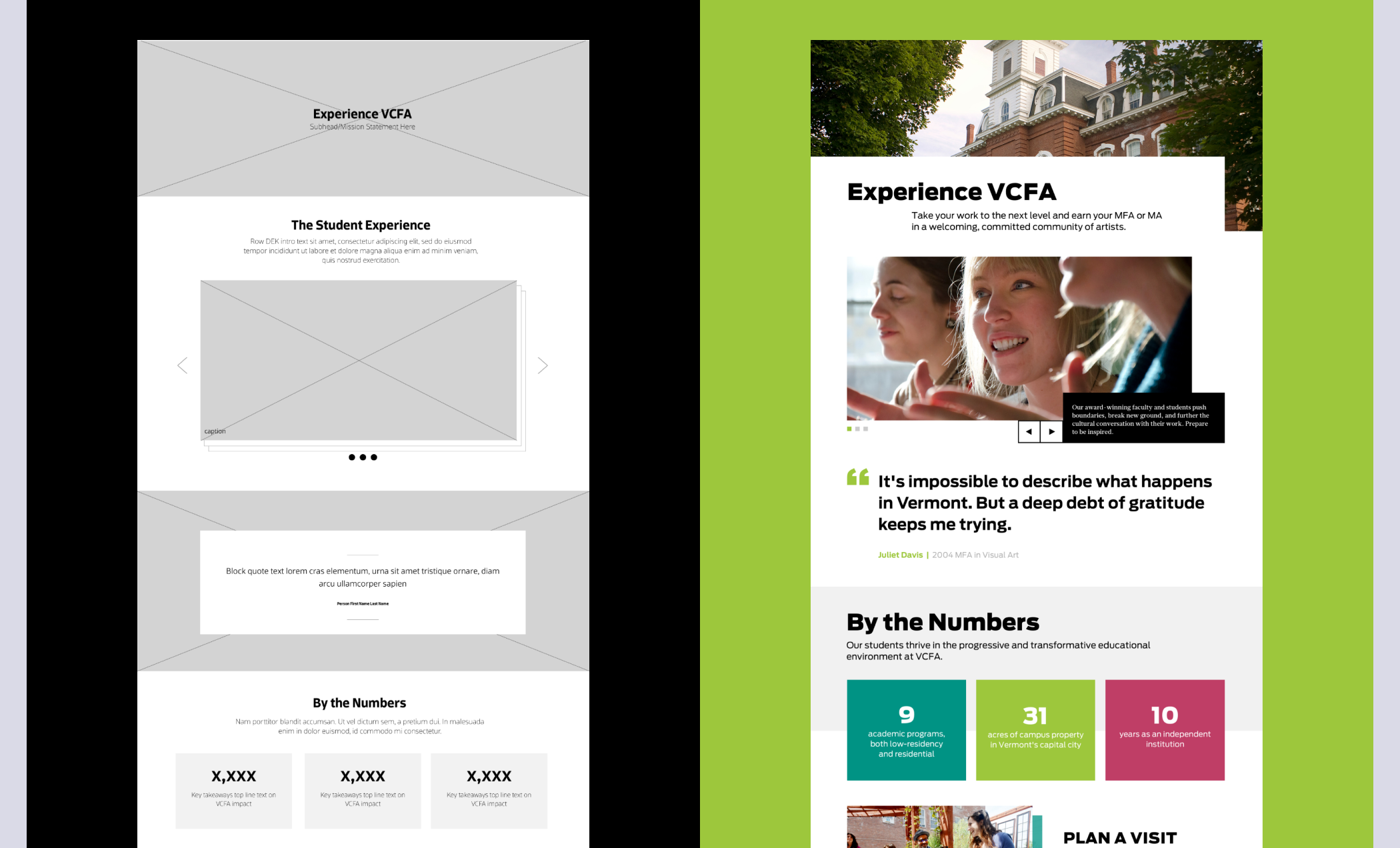
While VCFA’s old site contained lots of useful information, it was mostly scattered, lived in duplicate places, and was hard to find. We developed a new site structure that would remove redundancy while condensing and reorganizing VCFA’s information for the needs of different audiences. After researching and interviewing VCFA about their key users, we prioritized student, faculty, and alumni personas, and restructured information based on the users’ needs.
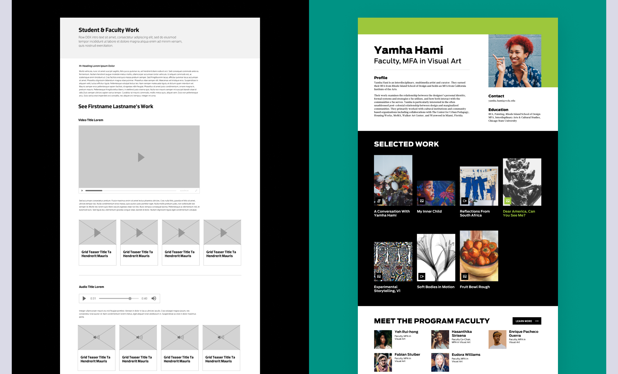
Component Library
Using the information we gathered from the IA phase, we created a content managing system that allows VCFA’s digital team to quickly create custom layouts based on the content needs of each page. This system allowed VCFA to understand which components in the backend were needed to build pages and update content, which resulted in improved visual consistency.
Working with our development team and our Creative Director, I helped to not only design each component, but also provide a clear naming system and component library for developers. Since we were working on a tight budget, we also were mindful of the number of components we were designing.

Translating UX into Visual Design
Thinking Outside the Box
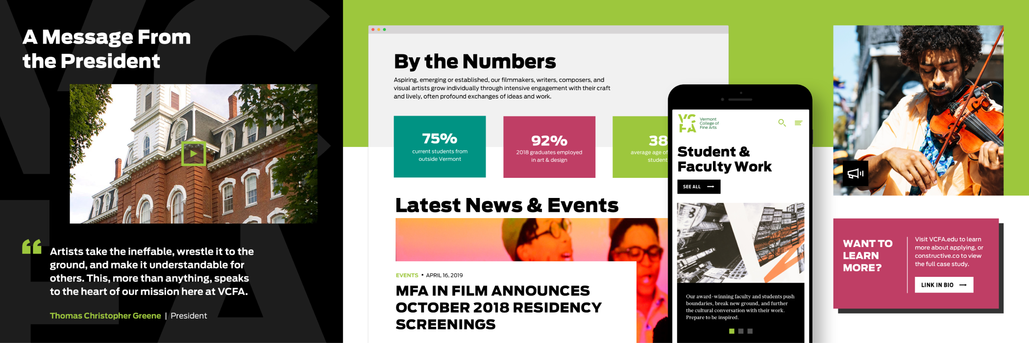
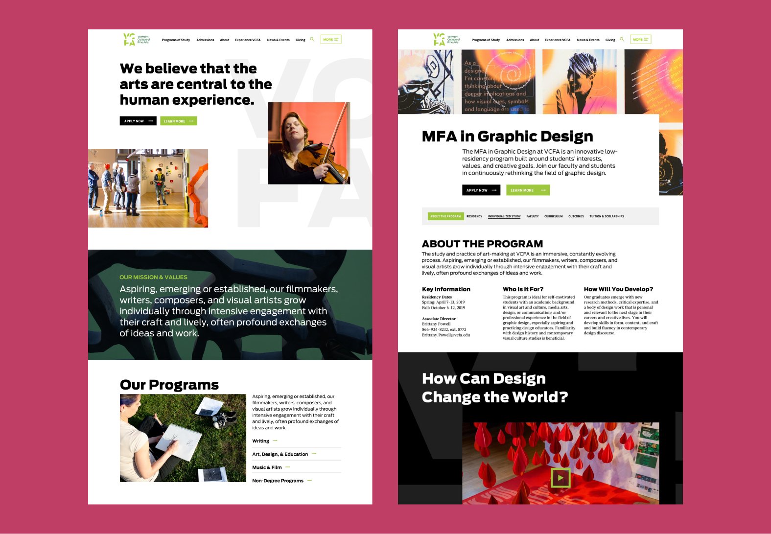
VCFA’s logo uses negative space to convey the idea of thinking outside the box. We drew on this concept for the visual inspiration for the website. Using bold typefaces as headers and unconventional geographic shapes, we broke out from the traditional grid system. By adding overlapping elements and transparent overlays, we emphasized VCFA’s commitment to creativity, experimentation, and innovation. The final touch in our visual design system was the use of carefully selected photography that showcases VCFA’s students, teachers, campus, classes in action, and stunning student work. It provides a captivating window into the diverse and unique experiences at VCFA.


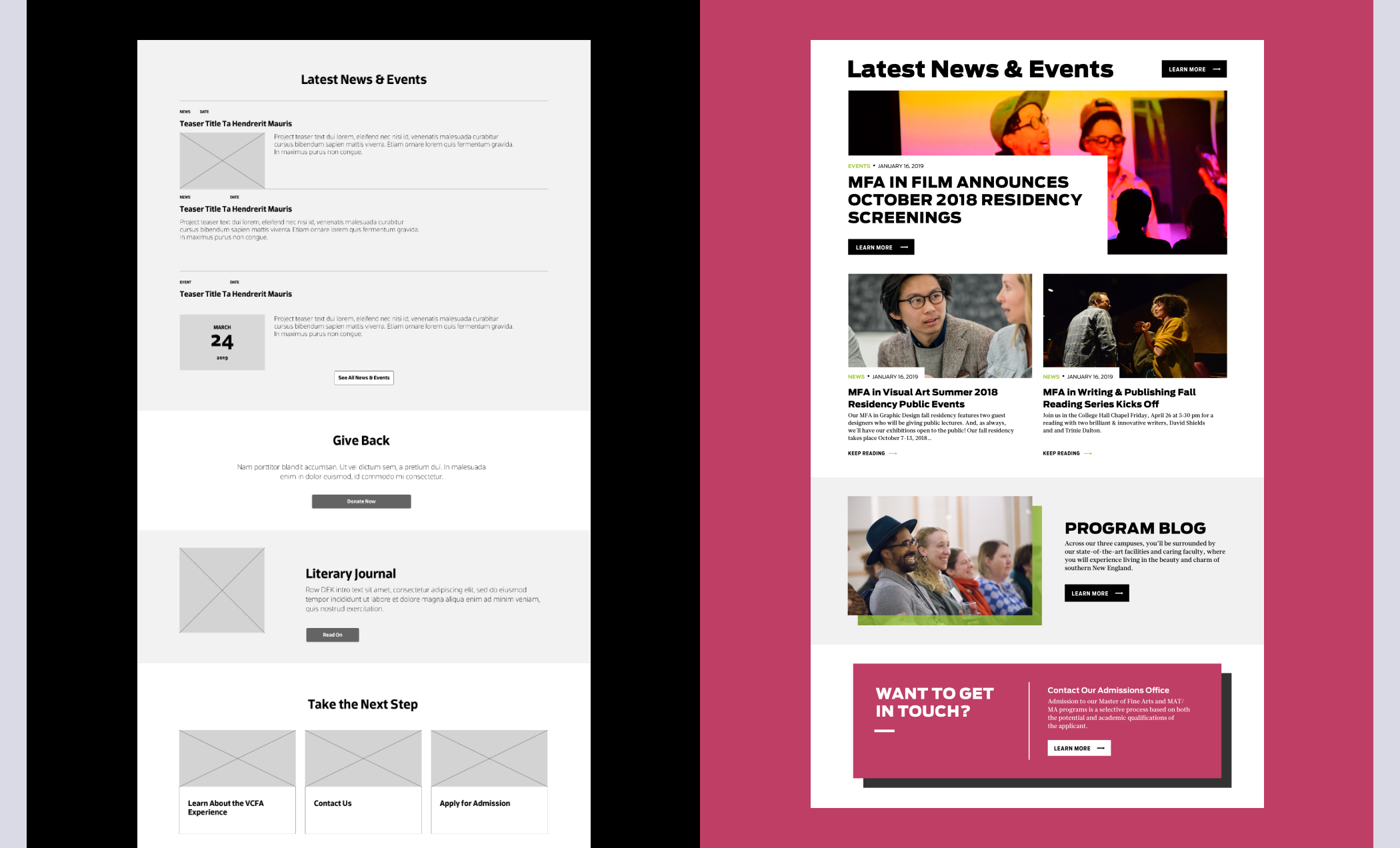
Designing for Content-Heavy Spaces
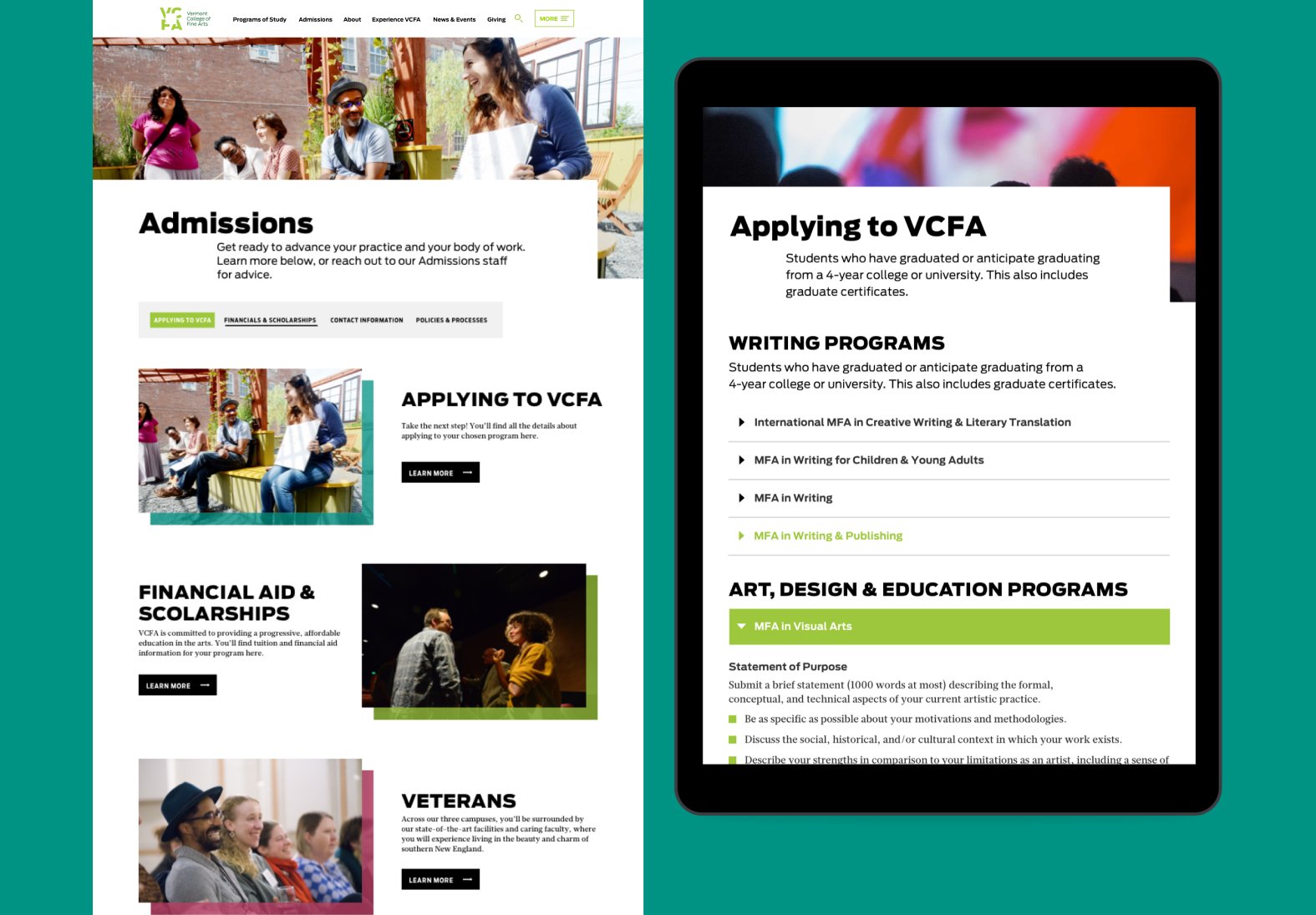
Since much of VCFA’s website contained important content-heavy hubs, making information more accessible was an important goal of this project. To do this effectively, we increased usability with collapsible content areas that allow users to select the content they want to see and hide the content they are less interested in. We also designed a scrollable tab for longer pages that used key call-outs to summarize the content on the page. This feature helps users get a better sense of top-level information without having them dig too deep into the page to search for the right content.
By focusing on component spacing, we also broke down dense content fields through the use of whitespace and the Gestalt laws of grouping. These editorial design techniques helped to create a more engaging reading experience and established a rhythmic visual and content hierarchy. Now, readers enter the content from multiple entry points.

Key Takeaways
TAKEAWAY 1
Understanding the Client’s Content Before Design and Development
In order to design for content-heavy sites, it’s important that all members of the team break out from a silo working approach. Cross-team collaboration improves communication so that the content is accounted for in all stages from design to development. By implementing these organizational structures beforehand, you enhance the overall page's design and function. At the same time, you can avoid having no design or cms ready for content that needs a home.
TAKEAWAY 2
Thinking Like a Designer and Developer
During the visual design phase, we carefully thought through how our designs would be developed. It’s not just about making something look good, but also making sure it functions well in the front and backend. To do this, we thought through how key components such as image teasers were built. Not only did they need to be updated with different photos, they also needed to have the option of choosing different color overlays.
We also considered the scalability of each component we added to our library given the time and budget constraints of our client. By sticking to the essentials, we provided the client with a more intuitive component library that will make updates and site maintenance easier. At the same time, giving end users a less cluttered user experience. All of these details are essential for a site’s longevity and upkeep.
TAKEAWAY 3
There’s Always Room for Improvement, But Strike the Right Balance
A big takeaway for me in this project was learning to continually question and check in with the project’s initial goals and objectives. It’s better to speak up early on if you see patterns in the UX that are falling short or a site structure that doesn't capture the grander scheme of the content strategy goals. While meeting a client’s budgets and scheduled benchmarks are essential to a good client relationship, it’s also important to recognize when to regroup, rethink, and redo. This brave act of vulnerability can lead to even better design solutions. It further emphasizes the need for ample ideation and research time before the bread gets baked.