Seamore Virtual Art Gallery
A mobile app that lets you explore art exhibits virtually from the comfort of your own home, or on the go

The Challenge
For many art enthusiasts, visiting an art gallery in person is exhilarating. However, various factors (such as limited time, tight budgets, and lack of accessibility) can hinder the experience.
The Goal
While there’s nothing quite like standing in front of a breathtaking masterpiece, virtual galleries offer a convenient and inclusive alternative for those unable to visit physical art spaces. The Seamore Virtual Art Gallery app aims to provide an engaging, accessible, and informative experience that enables greater access to art for art lovers everywhere.
Role
Lead UX/UI Designer
Created For
Google x Coursera’s UX Design Professional Certificate
Project Duration
March - August 2023
Understanding the User
User Research
To better understand pain points, interviews were conducted with users of diverse backgrounds and needs in the user research phase. A competitive audit was also conducted to assess how virtual art tours can be more accessible and engaging. Later in the design phase, two rounds of usability studies removed initial design assumptions. Designs were then refined to help users more easily understand and navigate the virtual art tour, and to create an accessible and engaging experience.
User Pain Points
Not Enough Time
Users with busy lives often find in-person art gallery visits too difficult to fit into their schedules.
Exhibit Entry Costs
High entry costs for some art galleries make it hard for people with tighter budgets to visit.
Lack of Accessibility
Art galleries aren’t always accessible for users who need language translation, wheelchair access, or screen reader technologies.
Exhibit Run Time
Exhibition run times are often varied, so some users might not get the chance to see an exhibit while it's open.
Competitive Audit
The goal of the competitive audit was to compare the user experiences and visuals of competitors’ virtual gallery tours as a new user. Research was collected based on competitors' general information (e.g., product offering, business size, unique value propositions), first impressions, interactions, visual design, and content. After information was recorded, an 8-page competitive audit report was written to summarize findings.

User Personas
To provide realistic and reliable representations of the product’s key users, personas were created from the user interviews. Users' backgrounds, goals, and frustrations were also considered while making their profile.
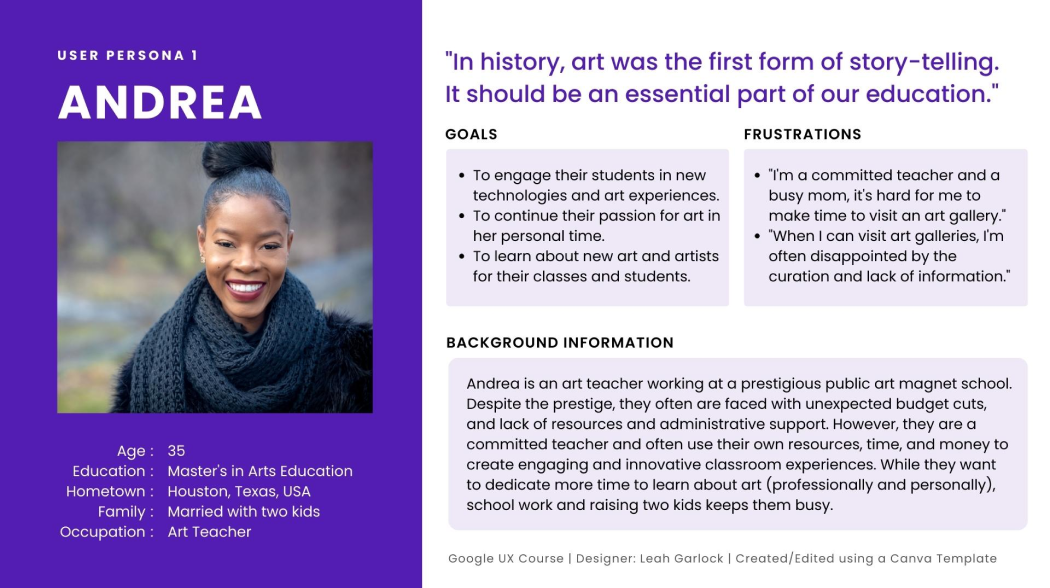
Andrea’s Problem Statement
“As a working mom and public magnet school art teacher, I want to find and use new technologies and art experiences so that my students and I can benefit from the knowledge.”
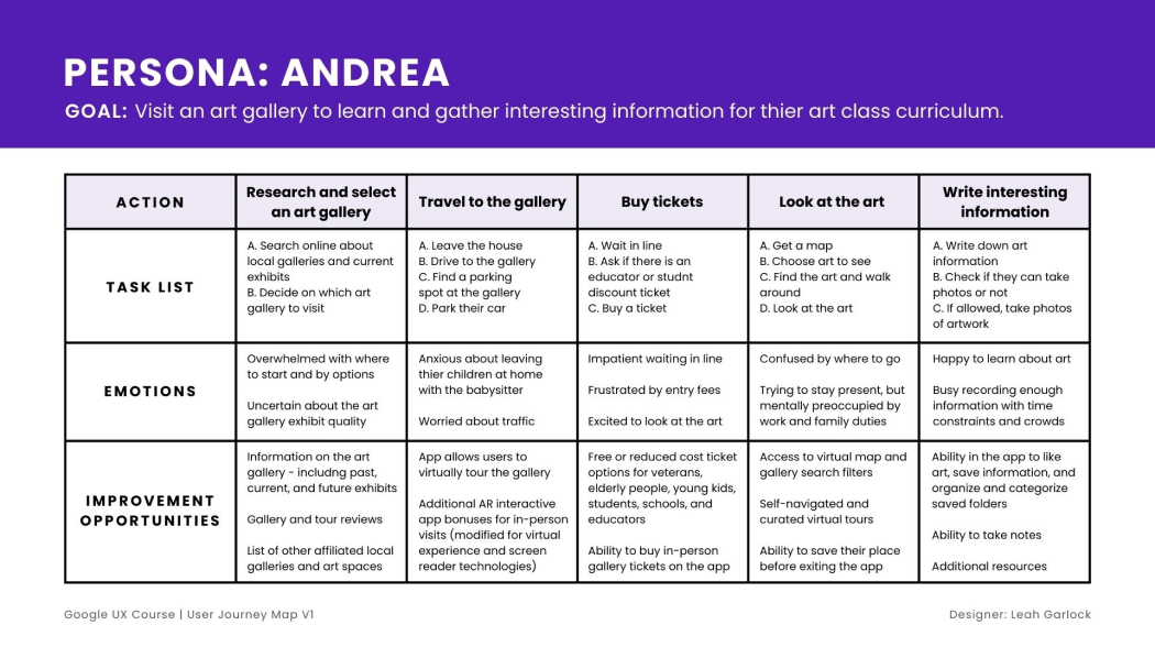
User Journey Map
Andrea’s goal is to find the right gallery to visit in order to learn interesting art information for their art class curriculum. While Andrea enjoys in-person art gallery experiences, the stress of a busy schedule and lack of time is a common thread throughout Andrea’s visit.
Starting the Design
User Flow
To create a singular user flow, information from the persona and user journey maps were consolidated. This flow shows the app’s path to find and start a tour, and then to finish the experience.

Storyboards
Based on the scenario to “Use Seamore Gallery’s app to go on a virtual tour of their new exhibit,” a Big Picture and Close-up Storyboard was written and illustrated.

The Big Picture Storyboard focuses on Ricky’s overall app experience. Ricky’s goal is to find visually accessible art experiences that fit into his busy schedule.

The Close-up Storyboard illustrates the app’s unique features. It offers visually accessible features and the ability to pause and resume virtual tours.
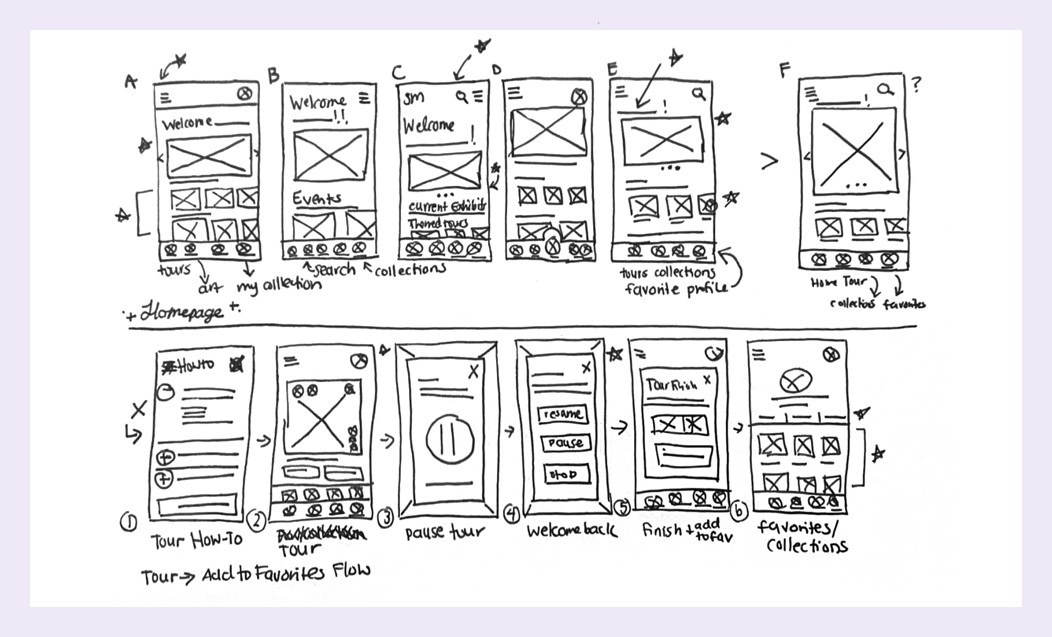
Paper Wireframes
While rapidly ideating ideas, paper wireframes were used to sketch out initial design layouts. To process multiple solutions and to avoid being married to one idea too quickly, different versions of the same screen were created. Elements that worked were later refined and narrowed down to one screen.
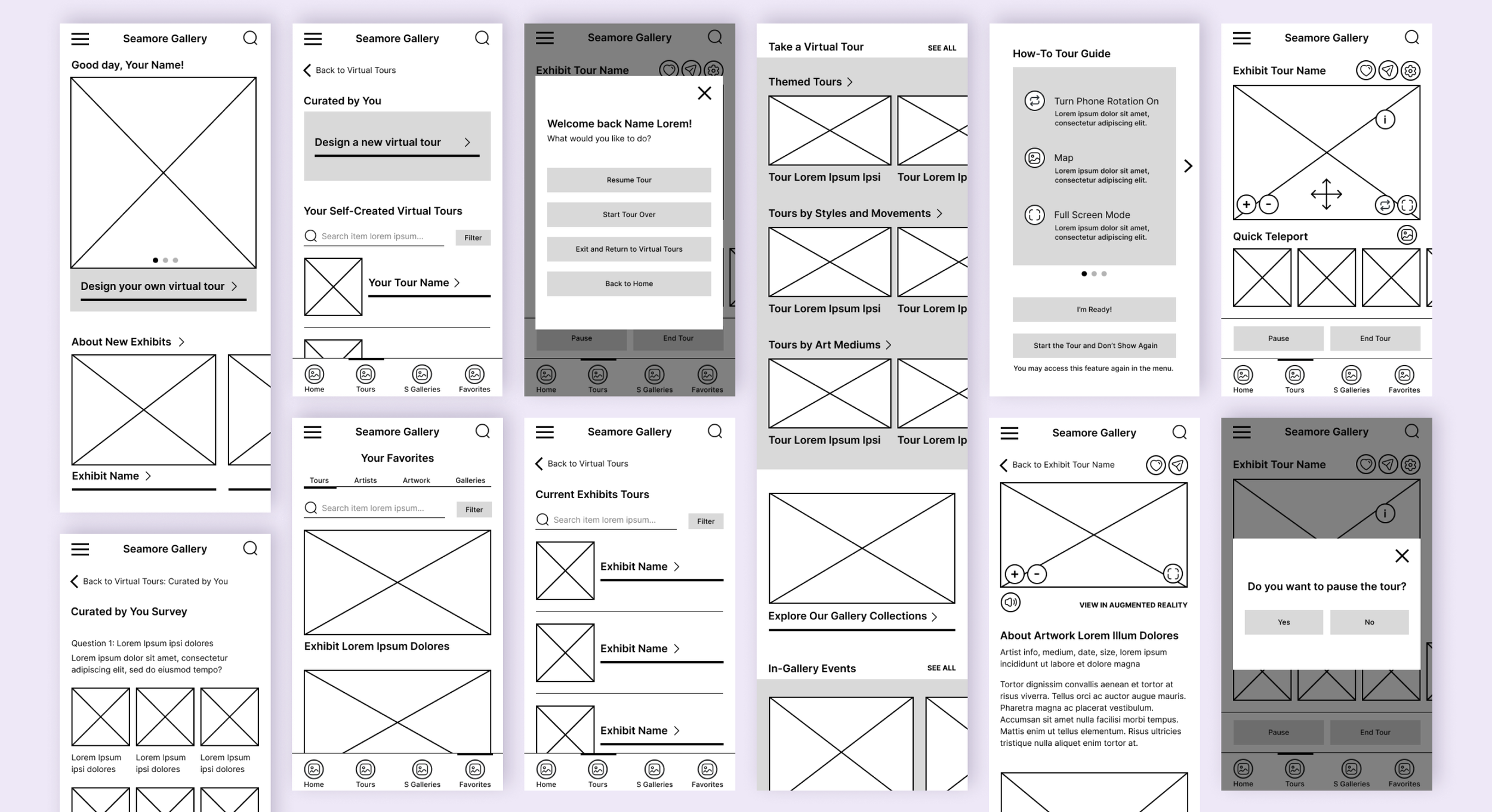
Digital Wireframes
Elements from the paper wireframes that worked made their way into the design of the digital wires. After fleshing out more the user flow into app pages, a low-fidelity prototype was created for user testing.
Usability Study Round 1
Research Plan
To better understand pain points, we conducted moderated usability studies with users of diverse backgrounds and needs in the user research phase. To assess how virtual art tours can be more accessible and engaging, a competitive audit was also conducted.
Affinity Diagram
The user research notes were written on individual sticky notes, and then divided into categories and subcategories based on themes. From here, research findings and insights were developed and woven into a research report.
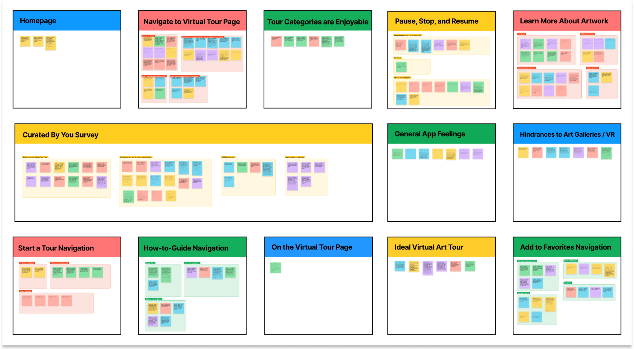
Research Findings
First round insights from the usability study were conducted with the low-fidelity prototype and yielded these findings:
Curated Tours Feature
The Curated Tours feature
is too confusing for users to understand. In order to improve the user experience, it should be revised.
Homepage Structure
The Homepage content should be restructured so that starting a virtual tour is easier and more prominent to find.
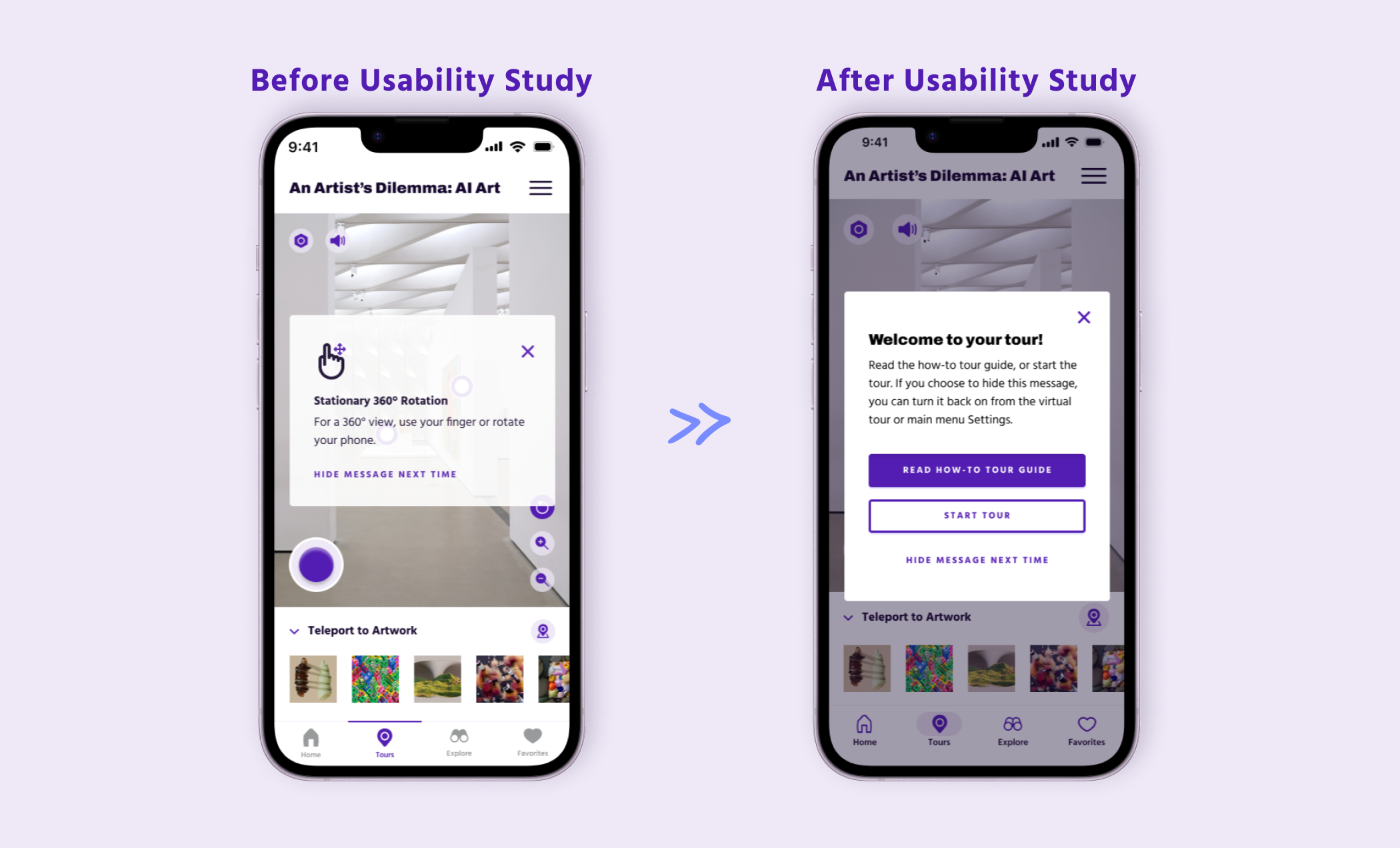
Revamping the How-to Tour Guide
The How-to Tour Guide needs to be more informative and concise so all users can understand the directions before the tour.
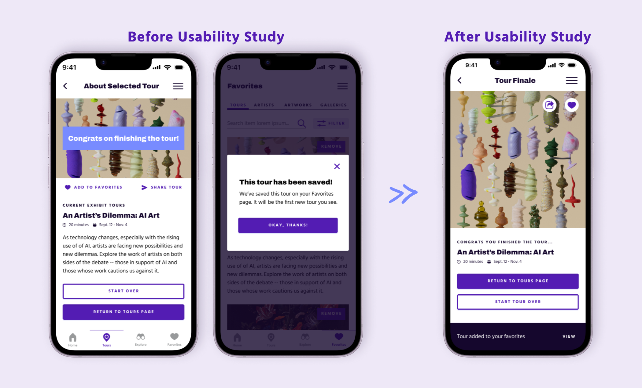
Adding Tours to Favorites
A confirmation message is needed after the user adds a tour to their Favorites’ lists.
Navigational Elements
Navigational CTAs, button copy, and nav bars should be edited so users can find what they are looking for with greater ease and efficiency.
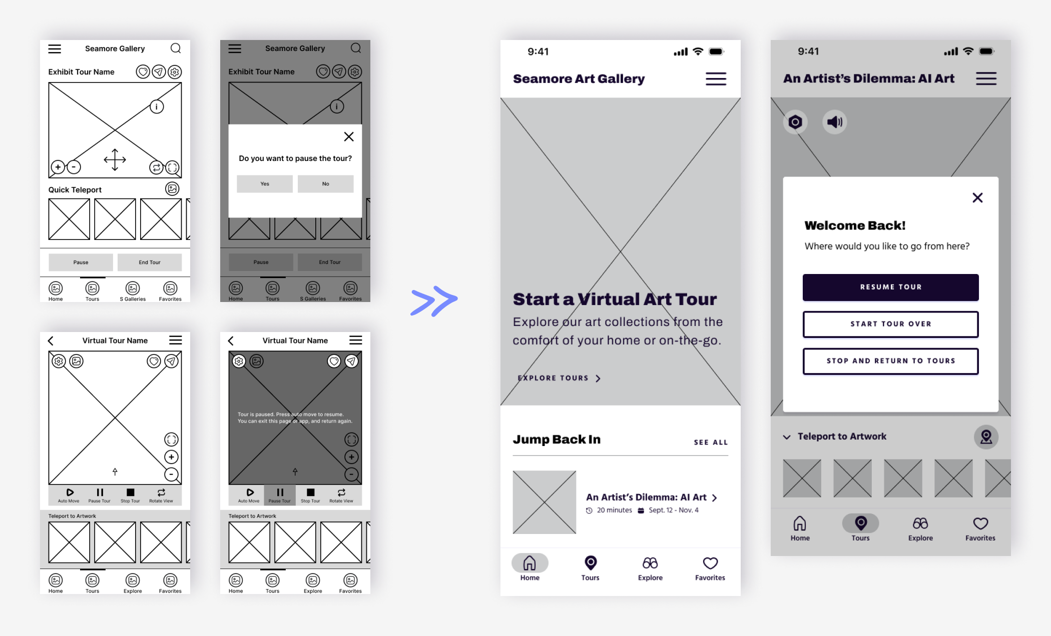
Pause and Start Tour Feature
The pause feature should be re-examined for different use cases and settings.
Refining the Experience
After the research phase, the design was edited based on top level priorities. The biggest changes were the removal of the Curated Tour feature and the virtual tour Pause and Stop features. The virtual tour experience was also revamped to better meet users' needs.
Removed Curated Tours Feature
The Curated Tours feature caused a lot of confusion with users. In the revisions, this flow was ultimately removed because it didn’t support the original pain points and user goals.

Removed Pause and Stop Features
Users found the Pause and Stop feature unnecessarily frustrating, so other design options were considered. The final version allows users to automatically pause the tour whenever they leave the tour screen (either by navigating elsewhere or exiting the app.) Users can restart the tour from the homescreen or when they choose to restart the same tour. Removing a few extra interactions to exit and restart tours creates a more seamless experience.
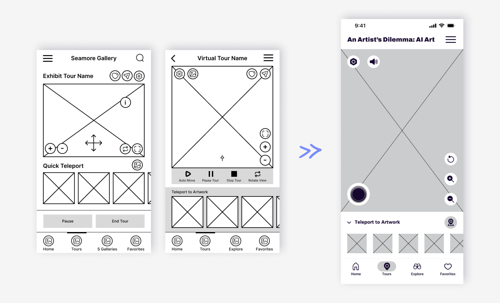
Reimaging Virtual Tour Navigation
The navigation through the virtual tour was ideated based on user feedback and pain points. The biggest qualm users wanted to avoid were glitchy movements, so game design features were brought in to make movements more smooth and seamless.
Creating a Style Guide
Visual Concept
The visual design was influenced by the app’s name. “Seamore” is a blend of two words, “sea” and “more.” Thus, at this art gallery you can see more through enhanced art experiences such as virtual tours. From these words we can imagine images like telescopes, deep seas, horizons, and magnified elements – all of which inspired the brand’s type and color palette.
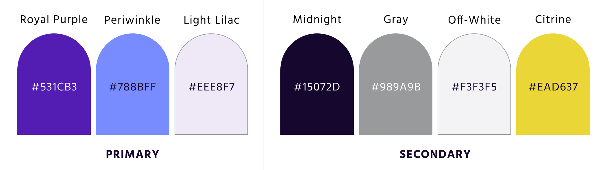
Color Palette and Typography
The color palette was derived from the app’s visual concept. The palette also displays symbolic color meaning. Purple represents creativity and individuality. Yellow symbolizes curiosity and positivity. To ensure compliance with WCAG color contrast guidelines, hex values were adjusted.
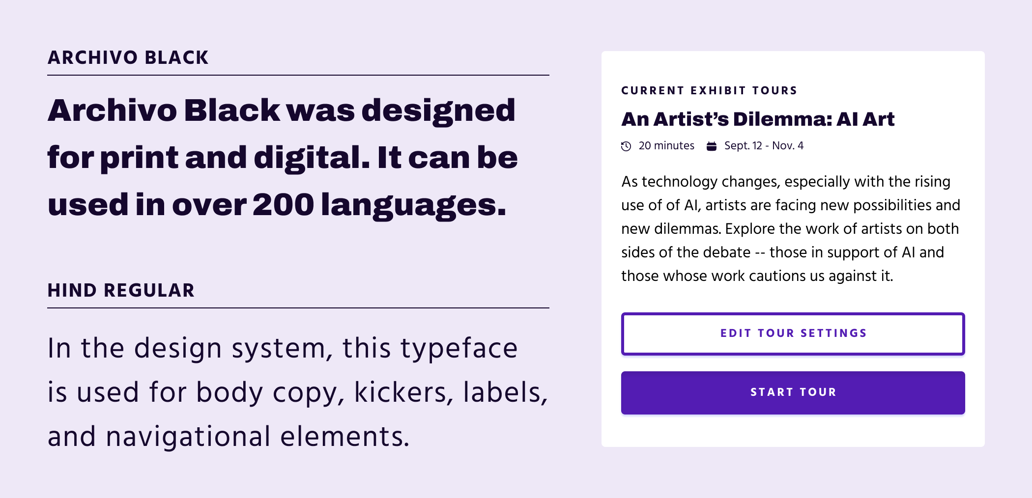
A Major Third Type scale was used to create visual harmony and consistency throughout the design.The brands typefaces are Archivo Black and Hind – both Google fonts handpicked for this project based on readability, contrast, and digital and print performance.
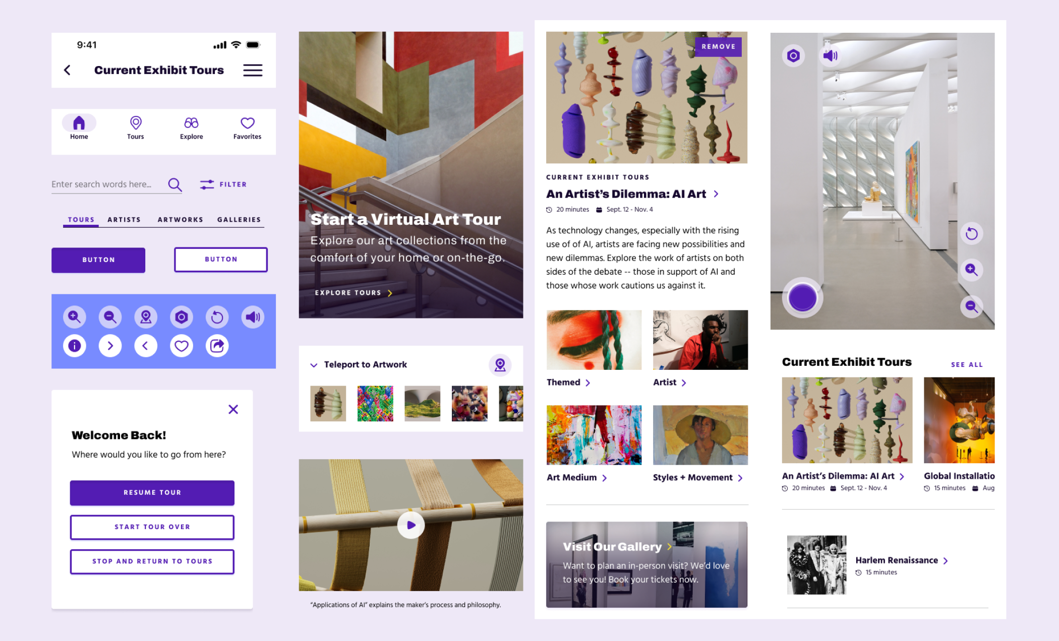
Component Library
Creating a component library allowed quicker design turn and smoother editing workflows. To ease any future headaches for developers, the library was simplified and design patterns were reused; this also ensured visual consistency and simplified the design to development handoffs.
Usability Study Round 2
After the visual design was applied, a second test was conducted. In the second usability study, users of diverse backgrounds and needs were given tasks to complete based on the updates from the last study. Focus on the app’s How-to Tour Guide and the navigational experience of the virtual tour were prioritized in this round. Accessibility considerations were also noted and refined throughout the app.
Accessibility Considerations
Color Contrast
The color palette was created in accordance with WCAG color contrast guidelines.
Audio Tour Features
The app offers audio tour guides and features to help users see through expressive and compelling descriptions.
Enlarging UI and Typography
UI elements are enlarged and spaced out for easier touch targets. To help improve readability, type size and spacing are also enlarged.
Polishing the Visual Design
After the second round of usability testing, the high-fidelity prototype was refined and updated based on user feedback.
Revamping the How-to Tour Guide
Users requested more demos vs. directions. Reading many slides in consequential order can get monotonous and boring. By making copy shorter and by allowing users to participate in their own tutorial, learning how to use the app can be more fun and engaging.
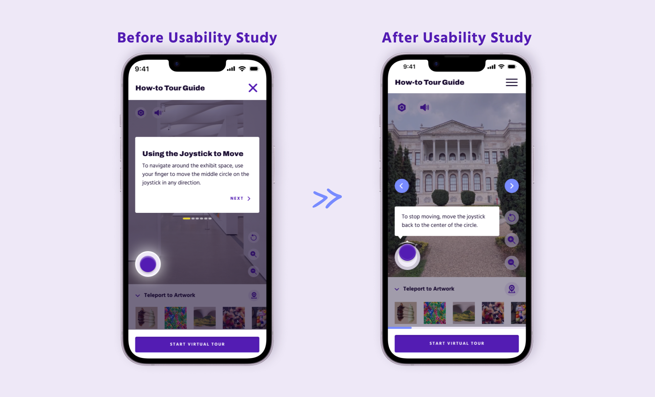
Minimizing Popups
In testing, users had mixed feelings for the tour pop-up windows. Many agreed they were unnecessary and pulled the user out of the desired experience. By making the How-to Tour Guide more concise and optional, users have more effective ways to learn the app’s features.
Learning More About Artworks
Users found navigating to learn more about an artwork confusing. To make the experience easier, additional pop-up windows and unfamiliar UI icons were removed. To learn more about the artwork, a direct path was created that lets users click on the information icon.

Favorites Page
For some users, finding the Add to Favorites path was too buried. To make it easier, UI elements were changed and laid out differently. Users also found the pop-up window and direct path to the Favorites page jarring. Many users wished for more subtle cues and a way to remain in the same flow after completing the interaction.
Key Takeaways
Impact
The final design resolves user pain points and meets the project’s original goals to create an easy-to-use, accessible, and informative virtual art tour experience.
“It's a really cool concept... (It) does give me the experience of having a museum experience from my own house or on the go.”
- Quote from a Research Participant
What I learned…
Check in with your research and user needs throughout the design process to avoid adding additional features that do not meet the users’ pain points or goals.
Test out your ideas early and often. Be willing to let go of assumptions and design pathways that no longer work.
Next Steps
Create screens that mimic all navigational and virtual tour functions in order to test out these designs with users.
Conduct another round of user testing on the how-to tour guide, as well as the app’s navigational flow.
Develop the user experience of the Explore section, which lets users learn and view the art gallery’s collections without going on a tour.