Heising-Simons Foundation
A digital and print advocacy report in support of California’s dual-language learners
The Client
The Heising Simons Foundation is a family foundation based in California. They partner with and support grantees who work within climate and clean energy, education, human rights, science, and community-based organizations
The Challenge
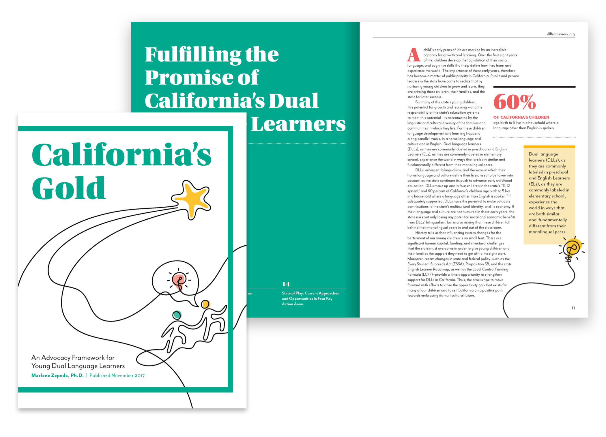
Dual language learners make up a growing part of California’s youth population. However, in the state’s current education system, tests and state assessments reveal that these children are at a greater disadvantage. In collaboration with Heising-Simons Foundation and Dr. Marlene Zepeda, we created California’s Gold: Capitalizing on California’s Diversity Today, for a Brighter Tomorrow, an advocacy framework report that analyzes dual-language education policy and practices. The report explains the issues behind education inequalities and explores possible solutions to overcome them.
Created
Constructive Team
The Heising Simons Foundation
Dr. Marlene Zepeda
Role
UX/UI Designer
Brand Designer
Focus Areas
Creative Direction
Information Architecture
User Experience Design
Web Design
Creating a Unique Brand Story
Visual Concept and Style Guide
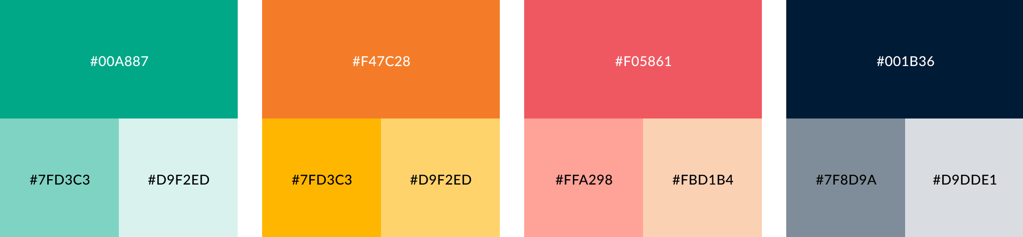
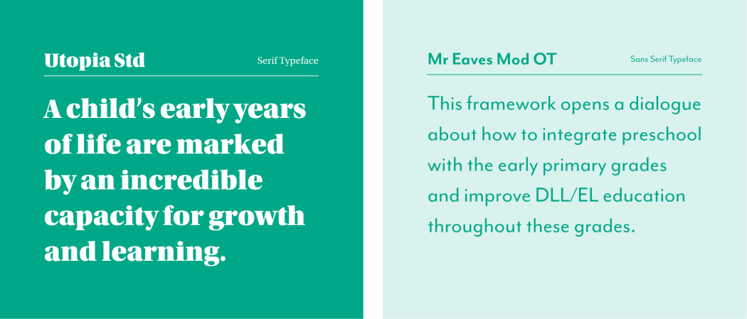
While the nature of California’s Gold is serious, we still wanted to capture the spirit of children in the design. By curating a vibrant color palette and creating rhythmic illustrations, we evoked the enthusiasm and optimism of young learners. At the same time, we avoided showing faces that might box in our ideas and add stereotypes to the report’s goals. We used complementary sans serif typefaces to evoke the academic nature of reports in a voice that felt friendly and innovative.

Prioritizing Print Design for Policy Makers and Education Experts
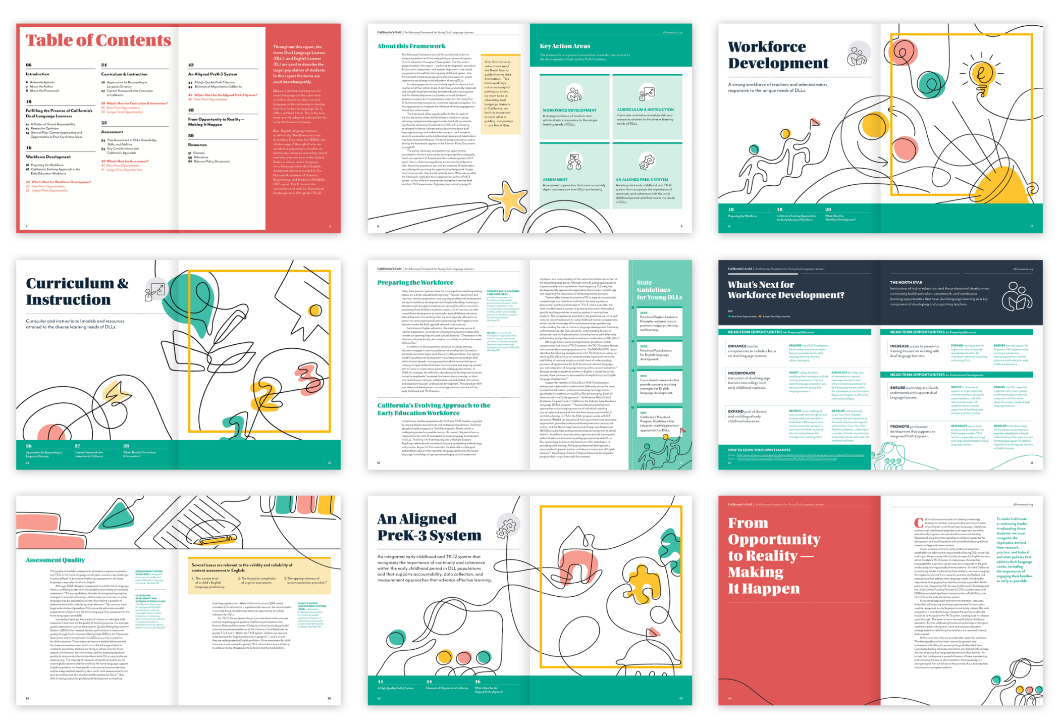
During our discovery phase, we decided to prioritize a printed report for policymakers and education sector experts. The report itself is large, so the content needed to have an easy-to-follow editorial rhythm. We chose a classic grid system that provided a structured design system and reinforced the framework’s evidence-based approach. In addition, we used bold headlines to attract attention and provide a clear information hierarchy for scanning.
Establishing Grids and Guides
One Sheets
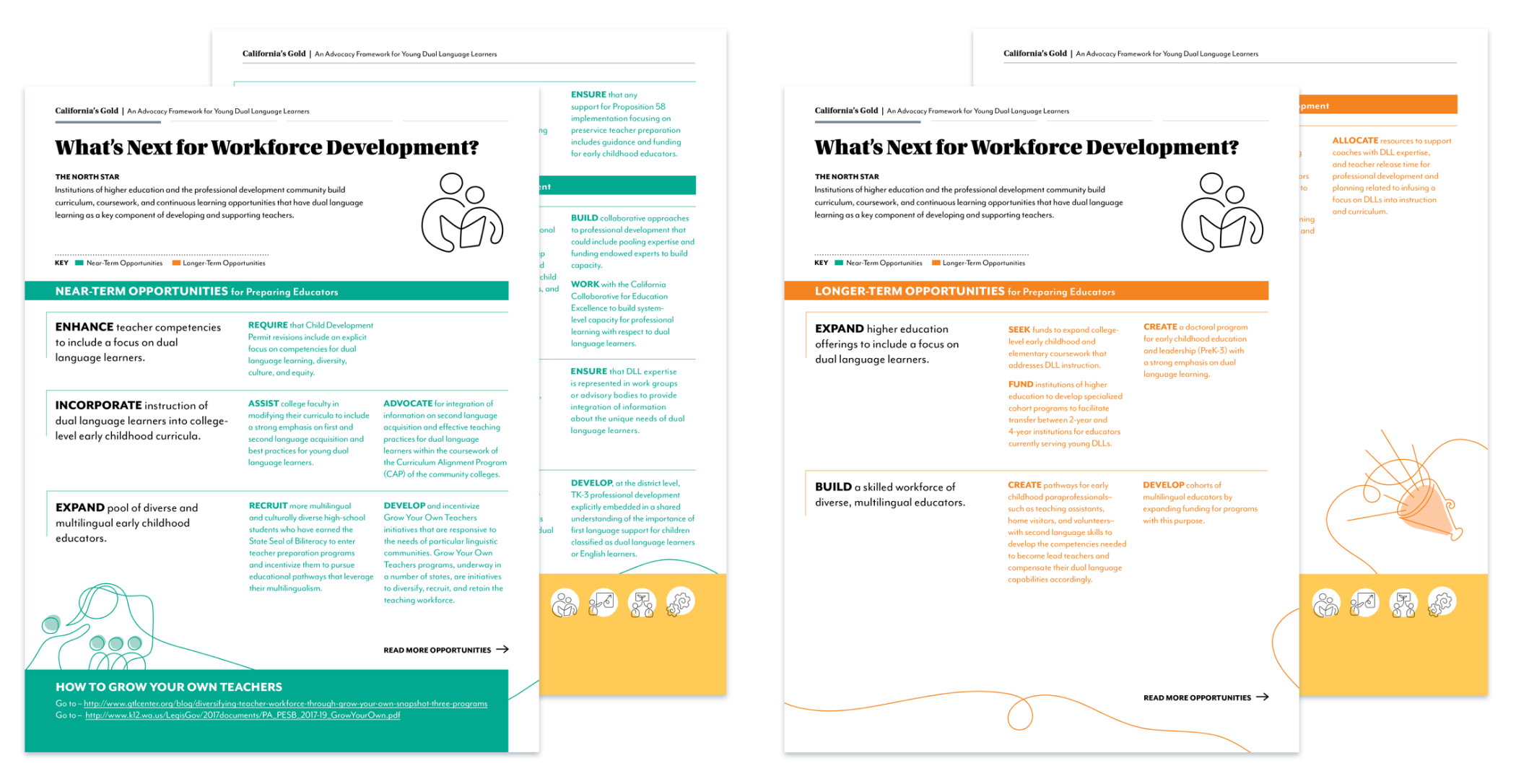
California’s Gold dual-language learning framework is built on four key action areas. In order to help break down the depth of information in the full report, we designed one sheets for each action area. In collaboration with the Heising-Simons team, our design focused on the facts to quickly provide information to teachers, policymakers, community members, and activists.
Designing a Complimentary Digital Reading Experience
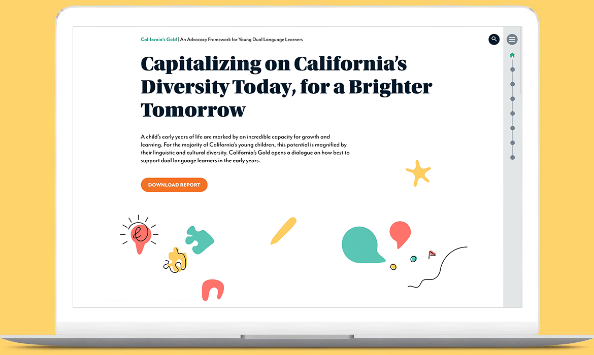
Digital Report UX
To ensure the report’s impact and influence, a digital strategy was essential to reaching a wider audience. We translated the print report’s linear experience into a responsive information architecture. To increase accessibility, we created multiple entry points through features such as search and an interactive glossary.
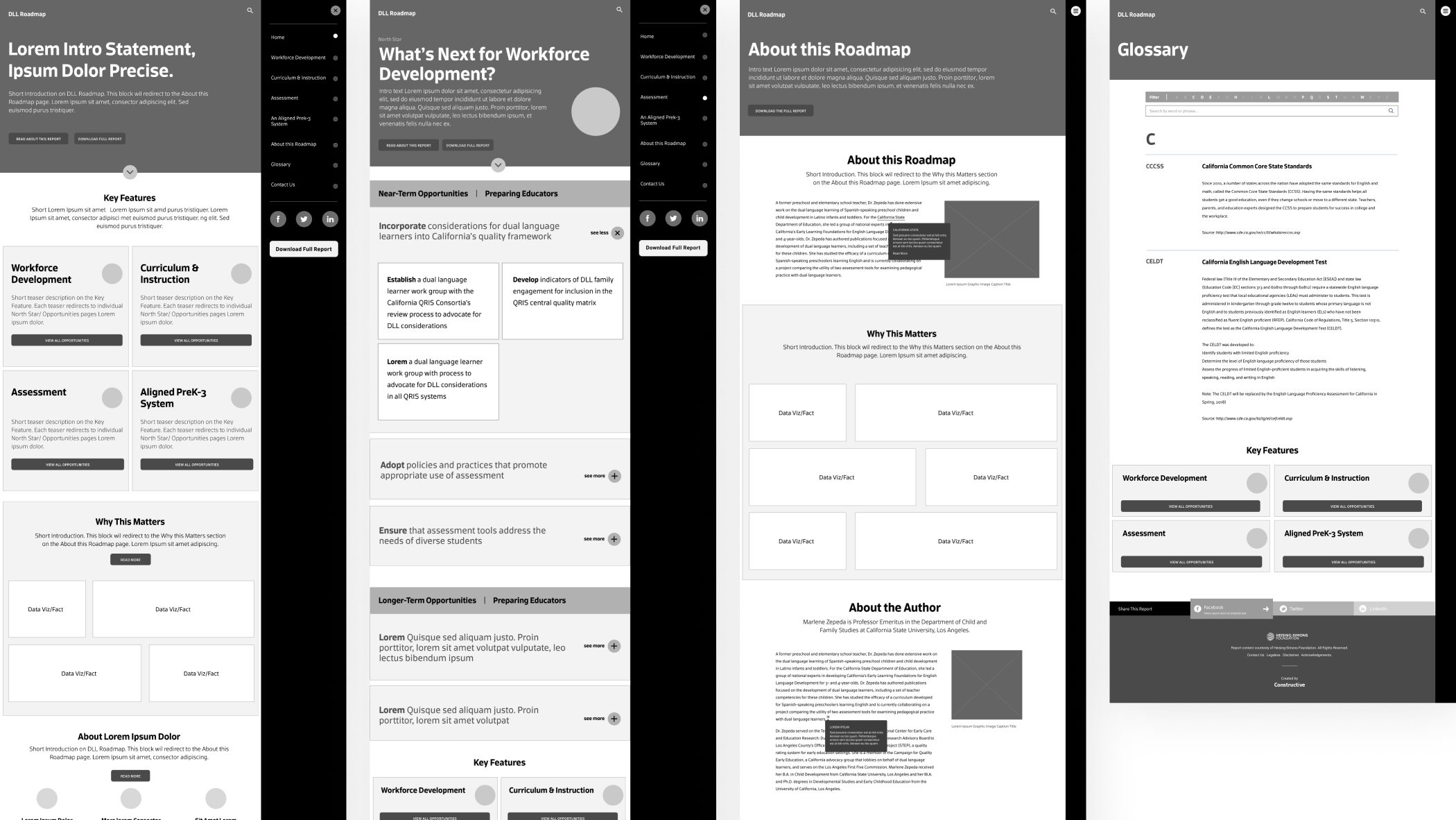
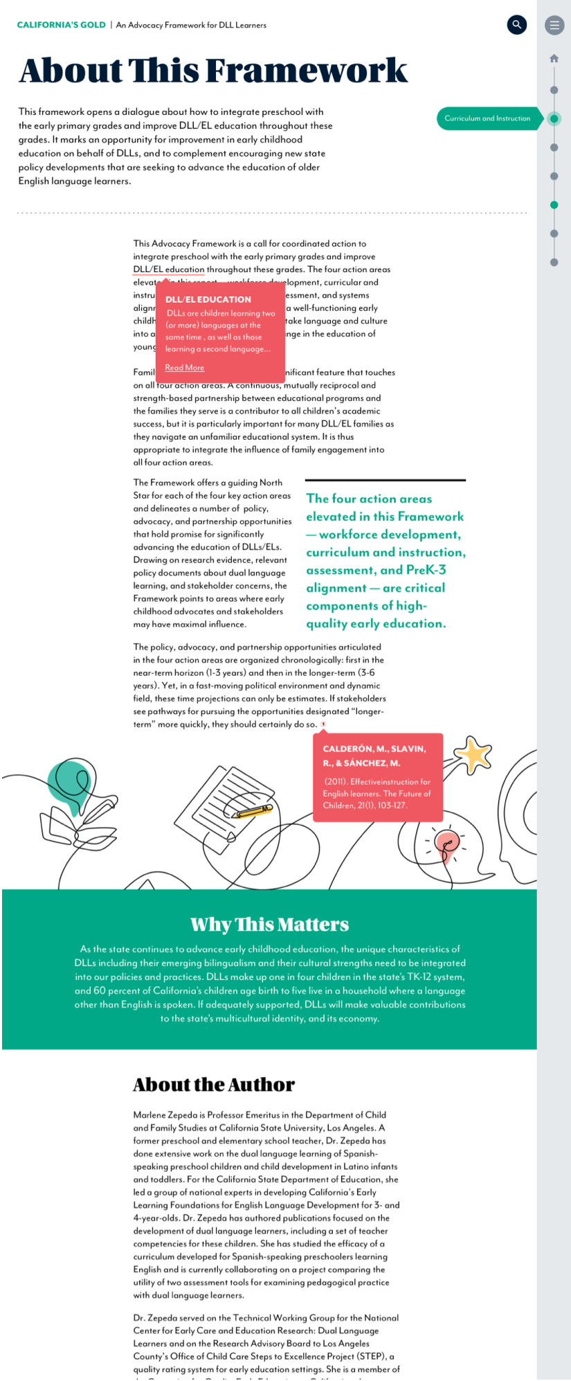
Digital Report
In the digital report, we visually extended California’s Gold into interactive elements that complement the report’s existing design system. We added iconography, buttons, and other elements for usability, wayfinding, and navigation. By animating the print design’s illustrations and bringing them to life, we captured the audience’s attention. The flow of the digital report complements the rhythm of the print report, furthering the continuity among all assets of the project.


Key Takeaways
TAKEAWAY 1
Don’t Forget to Put Pencil to Paper
Using design tools like Illustrator and Photoshop is great, but when it comes to ideating big ideas, we shouldn’t forget the magic that occurs when we put a pencil paper. By doing rough sketches, we avoid the designer’s downfall of being married to one idea too early on in the design process. When it came to creating illustrations for California’s Gold, we put much thought on the paper before we landed on the right voice and visuals. Since illustrations were a big part of the report’s visual storytelling, taking the time to “just draw things out” was an essential part of the process.
TAKEAWAY 2
Designing with the Audience in Mind
As mentioned, the report had many different audiences to reach, each with its own agendas and needs. With this in mind, we designed multiple entry points to digest the report’s content. Breaking up the content and summarizing it into more digestible chunks, we could effectively share the same story. By crossing both print and digital mediums, the report could reach wider audiences.