Show Up
A pocket-sized guide book designed for Right to Be’s public and street harassment bystander intervention training classes

The Collaborators
Right to Be (formally: Hollaback!) is a global nonprofit and movement whose mission is to end harassment of all kinds, allowing people “to be who they are wherever they are.” Through training courses, community building, story-sharing, and business partnerships, they rely on help from everyday people to help foster and create safer spaces for all.
The Center of Urban Pedagogy (CUP) is a nonprofit that uses design and art to create civic engagement projects by, with, and for marginalized communities.
The Challenge
Sadly, we live in a world where public and street harassment can violate our shared right to safe public spaces. While each of us can play a role in protecting one another, it is often hard and scary to know what’s the best way to intervene and support someone in the moment.
The Goal
As a Public Access Design Fellow, I collaborated with the CUP and Right to Be teams to create Show Up, a pocket-sized guide to bystander intervention. The guide uses the curriculum from Right to Be’s training sessions, breaking down actionable bystander intervention methods into simple steps that anyone can follow. Through this guide and Right to Be’s training sessions, the public can learn how to become empowered bystanders and allies.
Role
Lead Designer as a CUP Public Access Design (PAD) Fellow
Focus Areas
Creative Direction
Illustration
Print Design
Collaborators
The Center of Urban Pedagogy (CUP): Ingrid Haftel
Right to Be (Formally: Hollaback!): Debjani Roy, Leah Entenmann, and Agunda Okeyo
Special Thanks
WITNESS
Christine Gaspar
Nick Johnson
Oscar Nuñez
Deja Holden
Frampton Tolbert
Christy Batta
Sabrina Hightower
Breaking Down the Design Process
Designing for Evolving Content
Taking a content-first approach to the design process, we started with a rough content map for each spread. From there, we designed pages and spreads that could be edited and reworked as copy got approved. With this approach, the layout had to be flexible for updates, while still telling a visual story. It also had to be effective for quick scans and deeper reads. To achieve this, we relied on type hierarchy and scale, and used bold headers and subheaders to grab the reader’s attention and call out specific moments.
Example of our rough content map.
Initial drawings and content layout of the spreads.
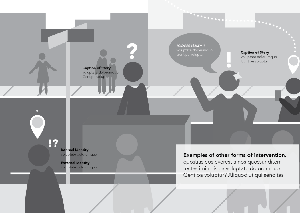
Character Design
Our collective goal was to design the guide’s characters to be descriptive, but not stereotypical. To do this, we removed any specific facial features, hairstyles, skin tones, etc. Instead, we focused on basic clothing and accessories, shapes, and the guide’s selected color palette to separate each character from one another. After refining the illustrations, we conducted bystander character studies with users to help us refine the characters further.

Character illustration exploration for Show Up.
Polishing the Visual Design
In November 2017, Show Up was launched during a training session hosted by Cornell’s IRL School. Since then, over 9,000 copies have been distributed across the U.S. as an open resource and guide in other bystander awareness training sessions. The following Show Up guide is the updated version from 2022.


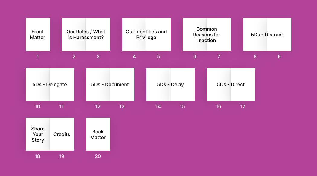
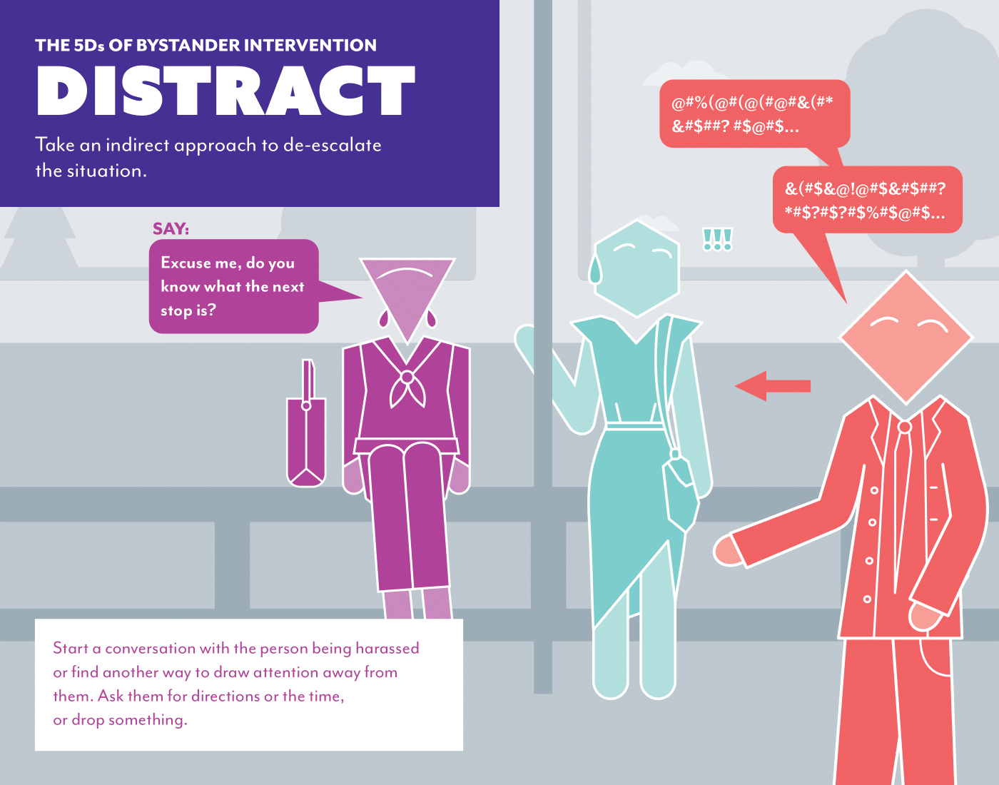
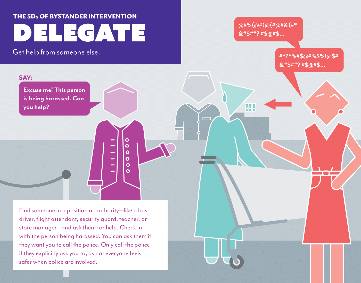
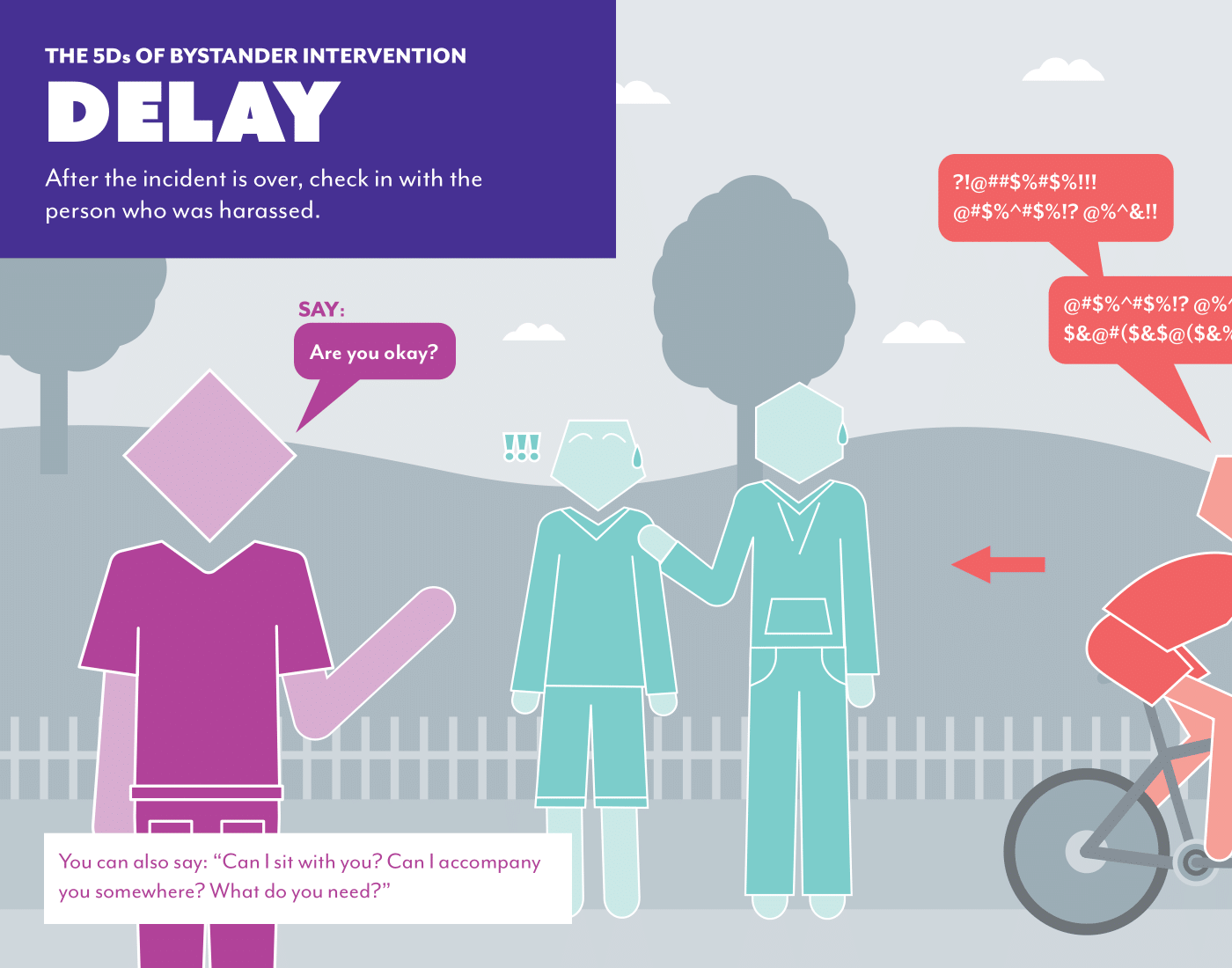
Designing the 5Ds: Environments and Scenarios
The Five Ds are five different methods you can use to offer support to someone who is being harassed. In order to provide enough detail and to illustrate a better sense of what types of scenarios each method could assist in, we made each of the Five Ds to have its own spread. Since the people and interactions were the center stages of the layout, we chose monochromatic backgrounds for all of the environments.


Key Takeaways
TAKEAWAY 1
Let It Go, Let It Go, Let It Go
From this project, I learned to let go of “precious designs.” If something is no longer working, change it. Don’t hold on to a layout or version of your design just because you like it. Sometimes you need to toss it out the window and start from scratch. You’ll get more effective results for the content and client you’re designing for.
TAKEAWAY 2
Don’t Design in a Vacuum
To become a better team member, I realized that just like my ideas, my design files cannot be created in a vacuum. This project taught me that I had to work harder to keep my file layers, folders, type styles, etc. organized and clearly defined to ensure a successful handoff. This becomes increasingly necessary for projects that are meant to be revisited and revamped later on.
Better Anticipate Project Timelines and Personal Capacity
TAKEAWAY 3
A big personal takeaway was learning how to better estimate and communicate how long a design phase might take. (Many times, it’s longer than you might think!) It’s important to sprinkle in design check-ins while working and communicating one’s own capacity in order to successfully meet benchmarkers. This not only ensures a happy client and a smooth design process, it also helps the designer get better sleep and not accidentally slack off on other work.